Why Nastaliq text breaks in most apps
Urdu looks wrong in most apps because no Nastaliq font was ever loaded, so the text falls back to whatever Arabic-script face the operating system happens to ship.
That fallback is almost always naskh: flat, upright, level-baselined. The letters are correct and the script is not.
In short
- Nastaliq rarely breaks because of a bug. It breaks because nobody shipped the font.
- Missing language and direction attributes make it worse, since the engine is then guessing.
- This website had the bug when the article was written, so the fix is documented here from the inside.
Why does Urdu render flat instead of sloping?
Because a font stack that ends in a generic family hands Urdu to the system default, and system defaults for the Arabic script are naskh, not Nastaliq.
Declaring font-family: 'Sora', sans-serif tells the browser to use Sora, which has no Urdu glyphs, then fall back to the generic sans-serif. What satisfies that generic for Arabic-script characters is whatever the platform ships: Noto Sans Arabic, Geeza Pro or similar, all naskh. Nothing in the stack asked for Nastaliq, so nothing supplies it.
The text is not corrupted and the letters are not wrong. It is the same alphabet in the wrong hand, which is why this ships unnoticed by anyone who cannot read the script.
What did the bug look like on this site?
You could read it in the font stack. This site loaded five families through Google Fonts, all Latin: Archivo, Source Serif 4, Sora, Libre Franklin and Hanken Grotesk. There was no Nastaliq face anywhere in the repository and no @font-face rule pointing at one.
So when an article here printed عام and آم inline, those characters were rendered by the reader's operating system in whatever it preferred, which on most machines is naskh. An article explaining that Urdu is written in a sloping script displayed its own examples in a flat one.
The hand-written app profile page did better in one respect: it marked its Urdu verse lang="ur" dir="rtl", so the engine at least knew the language and direction. The generated article pages carried neither, because the Markdown pipeline passed Urdu straight through as bare text with no lang and no dir on it at all.
Why do language and direction attributes matter?
Because without them the rendering engine has to infer things it could have been told, and inference fails at the edges.
Direction is the visible one. The Unicode bidirectional algorithm infers right-to-left runs from the characters themselves, which handles a clean Urdu sentence well and mixed content badly. Put Urdu beside a comma or a bracket, as our examples do, and that neutral character's side is decided by context rather than intent. That is how a full stop ends up on the wrong end.
Language is the quieter one. lang="ur" lets the engine pick language-appropriate glyph forms and lets font matching prefer an Urdu face where several are available. Omit it and you have given up a hint that costs one attribute.
Why do developers skip the font?
Not laziness. Nastaliq webfonts are genuinely expensive to ship, because the script is built out of ligatures rather than letters placed in a row.
A digital Nastaliq needs a large ligature table; the first, Noori Nastaliq in 1981, required more than 20,000. Modern OpenType is cleverer, but the files stay heavier than a Latin face. On a page already loading five Latin families, adding one is a noticeable cost for text that may be two words long.
A defensible trade, and also how the situation persists: every decision to skip it is reasonable, and the aggregate is that Urdu readers spend their lives looking at their language set wrong.
What does fixing it take?
Three things, and writing this article is what finally got them done.
Load a real Nastaliq face: Noto Nastaliq Urdu comes from Google Fonts unicode-range-subsetted, so pages with no Urdu download none of it, which removes the usual objection to shipping it. Scope it to Urdu rather than applying it globally. Then mark every Urdu run lang="ur" dir="rtl", which for generated pages means the build doing it, wrapping each Arabic-script run whole so the spaces inside a phrase do not fall back into the surrounding left-to-right context and reorder it.
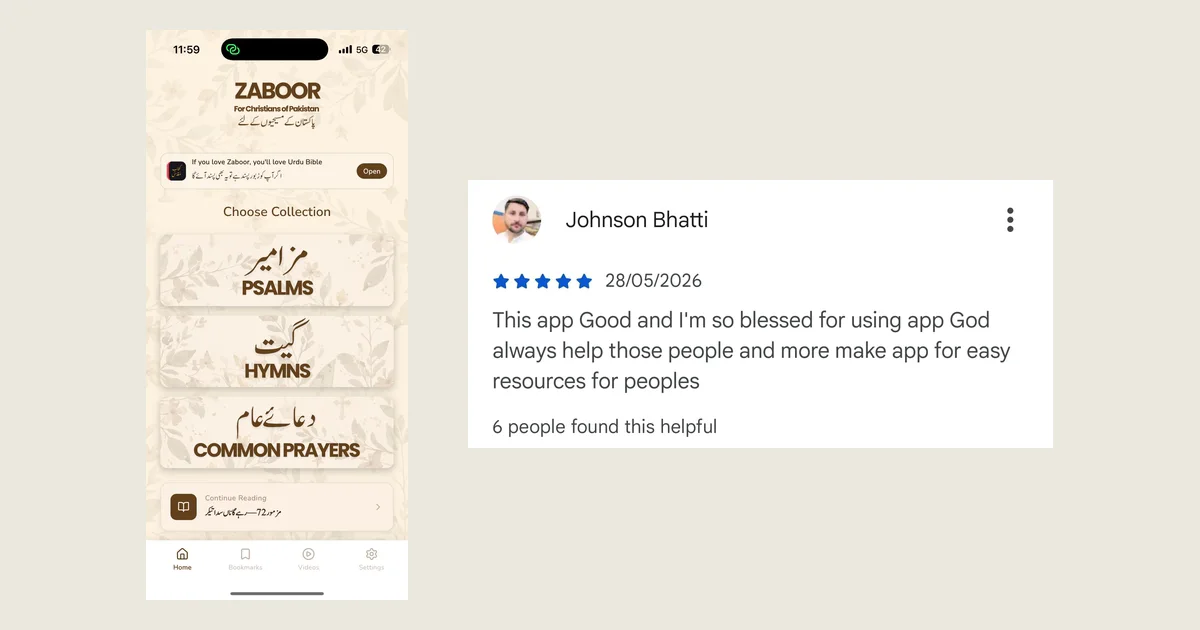
Urdu Bible never had the problem, because the app bundles its own typesetting instead of inheriting a website's font stack.
FAQ
Why does Urdu look different in different apps?
Because each app resolves its own font stack. If an app loads a Nastaliq face you see sloping calligraphic text; if it falls back to the system default you see flat naskh. The characters are identical either way, so the text is readable but visually wrong.
Is naskh wrong for Urdu?
It is not incorrect, since it uses the same alphabet, but it is not what Urdu readers expect. Urdu has been set in Nastaliq for ordinary text longer than any other language, so naskh reads as foreign.
Does adding lang and dir attributes fix Nastaliq rendering?
They fix direction and glyph-selection problems, especially around punctuation in mixed text, but cannot supply a font that was never loaded. You need both.
If you want to see Urdu set the way it is supposed to be, Urdu Bible typesets all 66 books in Nastaliq with a Roman line beneath. Free, offline, no ads.